With their head office in Stockton-on-Tees, Active grew from humble beginning to become one of the region’s largest independent firms of chartered financial planners. They have now served people of the North East and Yorkshire for more than 20 years.
Vision:
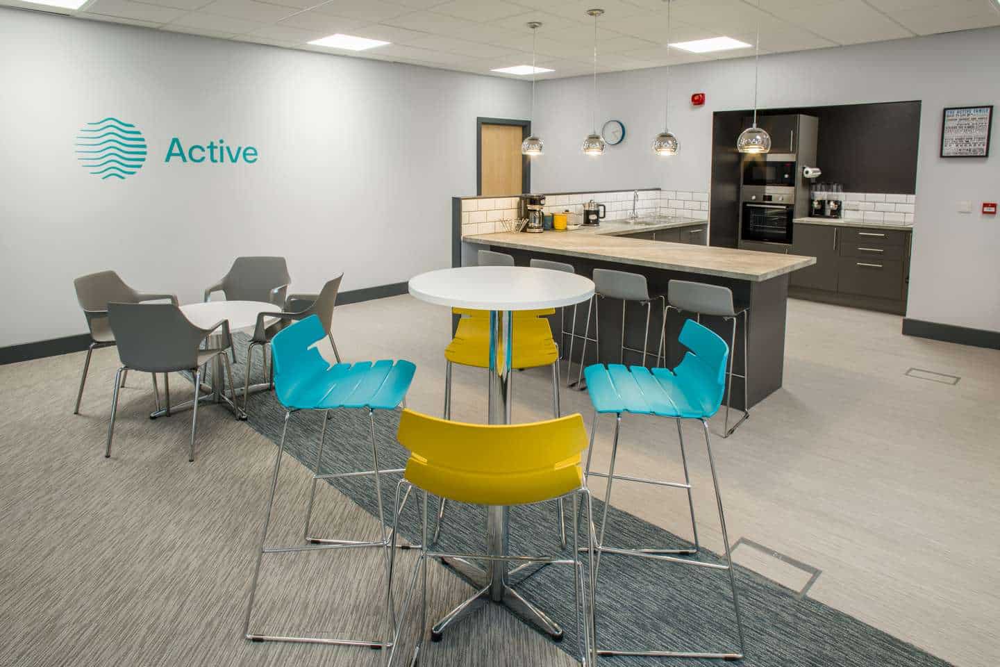
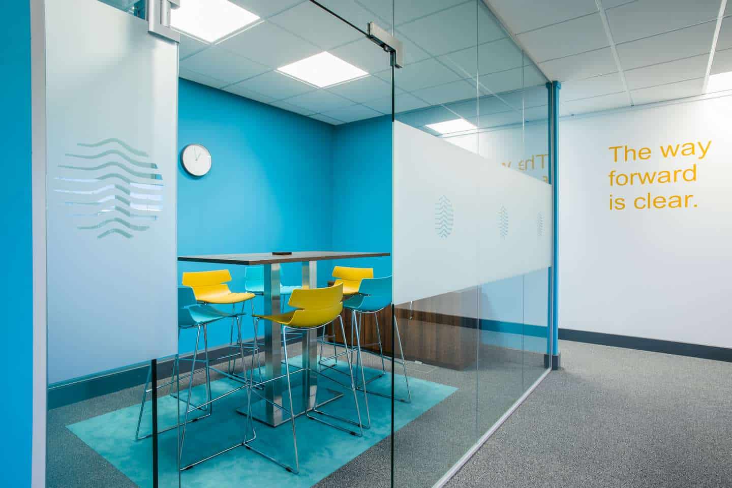
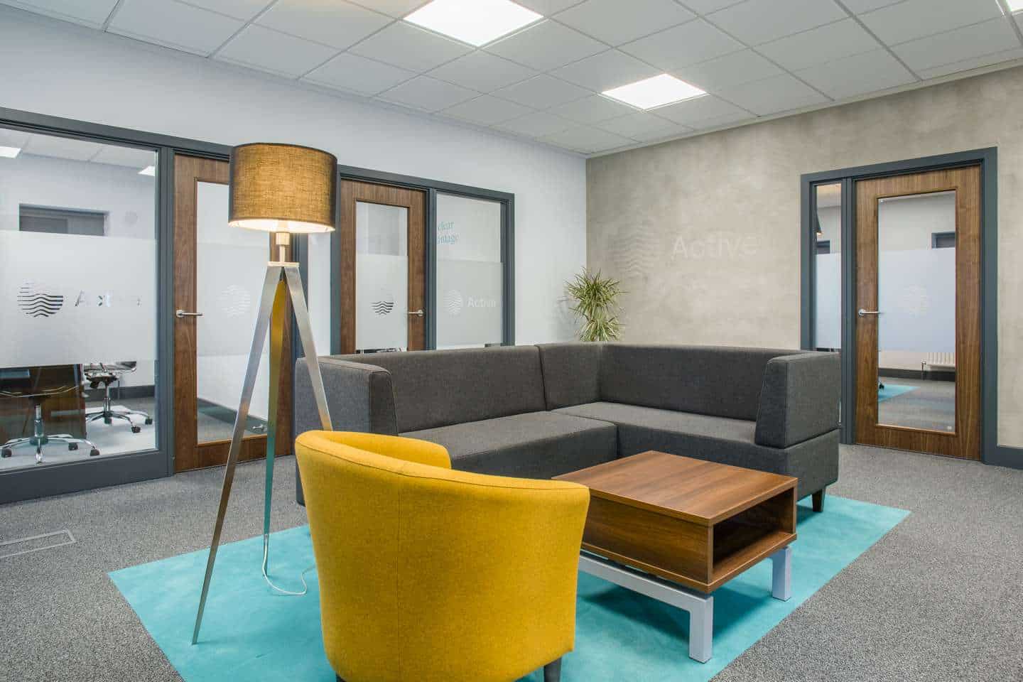
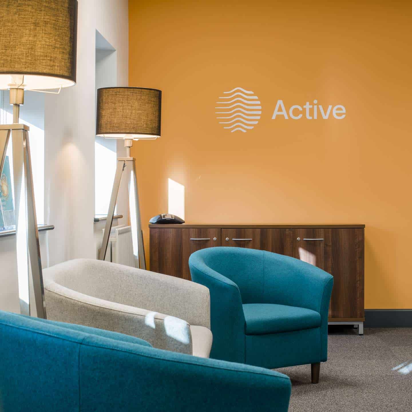
Clients trust Active to be experts in their field, but also to be warm and approachable. Therefore, we needed to create a balance between a ‘premium’ feel and the confidence that the Active team bring to their work. We decided on a sophisticated grey colour palette with splashes of turquoise taken from their logo designed by Better branding specialists which encompassed professionalism, quality and clarity with spirit and enthusiasm. Active’s Managing Director Karl Pemberton is also focused on the health and well-being of his staff, so we added a few surprises along the way!
Delivery:
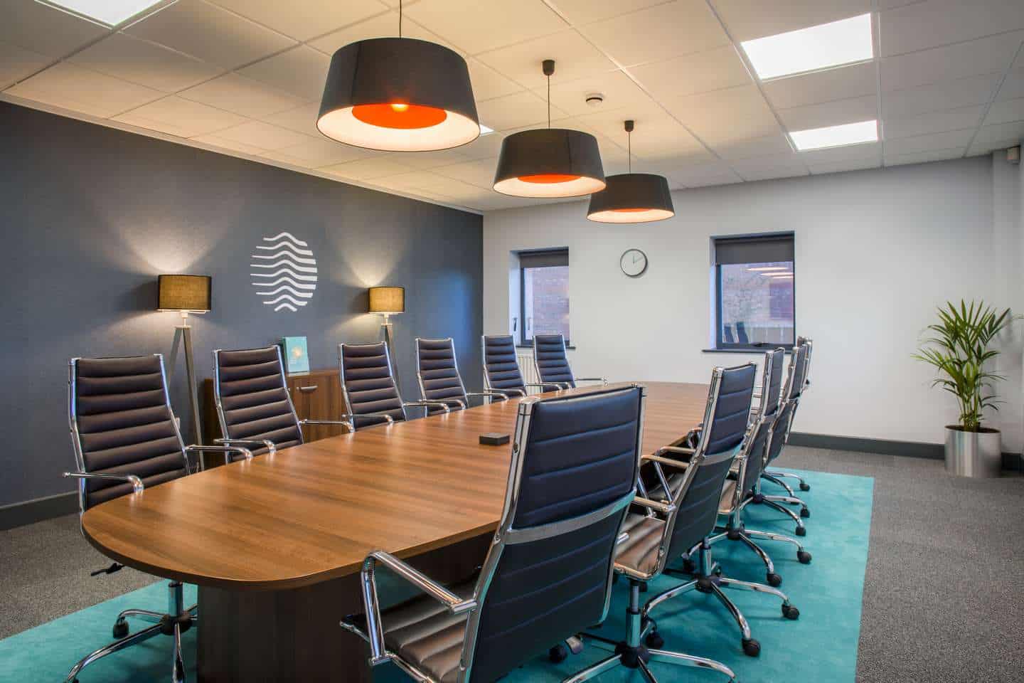
Using 3D visuals, our client signed off on new and improved client reception and meeting areas, and a new 30 seat conference room to allow them to host more client focussed events. We looked at how we could translate the messages which their brand portrays into the materials we used and decided on using timeless finishes such as timber, glass and concrete which symbolised the strong and honest approach of the business. The branding then supplied the pops of colour needed to break through the neutral tones of the space, resulting in a vibrant work atmosphere. The addition of a games room which we turned around in just 48 hours went down a storm with the team!
We looked at how we could translate the messages which their new brand portrayed into the materials we used and decided on using timeless finishes such as timber, glass and concrete which symbolised the strong and honest approach of the business
The branding colours then supplied the pops of colour needed to break through the neautral tones of the space and created a vibrant atmosphere to work in.

Cocoon & Bauer, based at the Heart of the Tees Valley creates spectacular interiors for the residential, commercial and hospitality sectors across the UK.